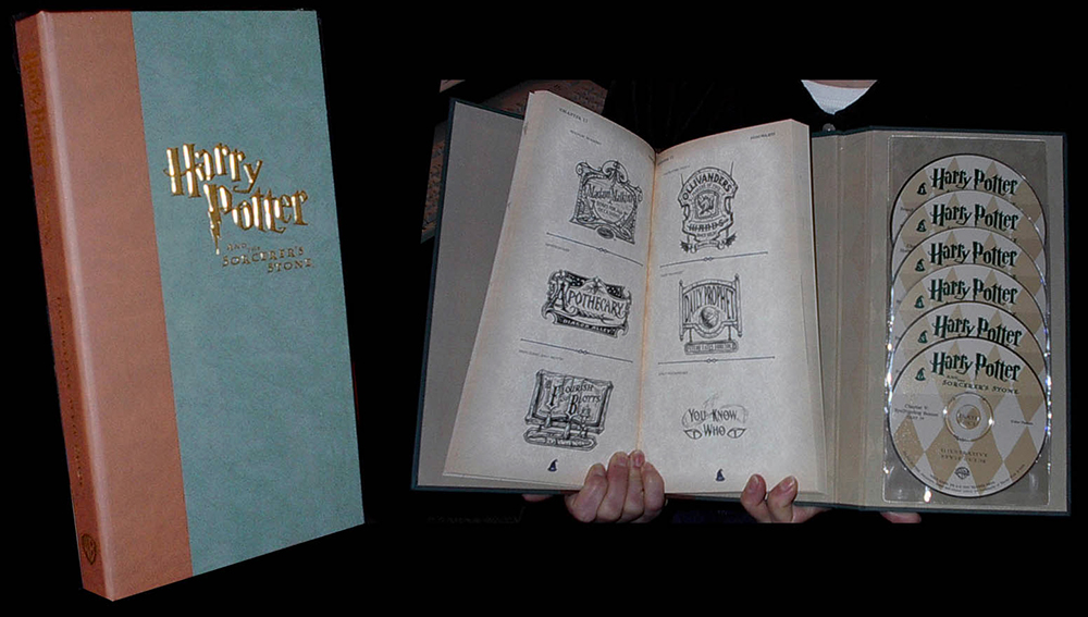
The recent release of the final chapter of the Harry Potter saga has caused me to reflect upon how J.K. Rowling’s magical creation affected me over a decade ago. In the spring of 2000, Warner Brothers was furiously at work on production for the first film episode. In conjunction with filming they were putting together an official style guide to distribute to merchandisers so that all the various products to follow would maintain consistency in their look. I was approached by an L.A. design firm that was working directly with Warner Brothers to contribute my digital scratch board style to a long list of preliminary designs. The task was an enormous undertaking: create over 50 finished pieces in a week.

Among the endless hours of work that week, one of the highlights was receiving a fax with J.K. Rowling’ signature next to her visual take on how she envisioned the sorting hat should look. The studio’s version was more of a puffy Disney-esque style that was changed to a leaner, pointy classic witches hat version.

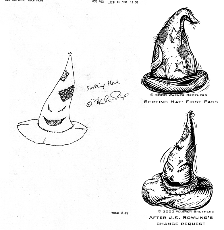 (Upper right) Warner Brothers initial sorting hat design request that I worked up. Fax received of J.K. Rowling’s sketch of the sorting hat on the left and my version of the finished approved version from her on the lower right.
After the first batch was completed and approved, I received additional requests over the next few weeks that brought my total contribution to over 100 pieces. After the first film’s release, the marketing of products shifted dramatically from using illustration to using movie stills and photography. Before that happened there was a magical window of time when a trip to a (now defunct) Warner Brothers store in the mall yielded tables and racks full of items that sported my efforts on the project.


Like this:
Like Loading...
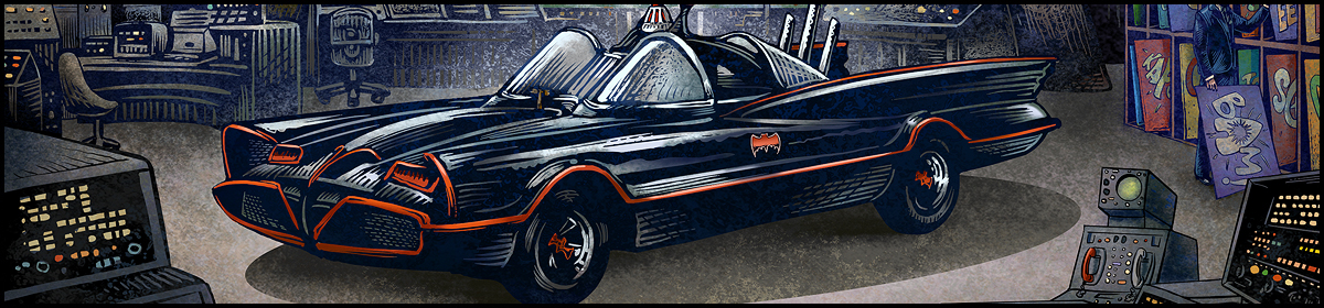
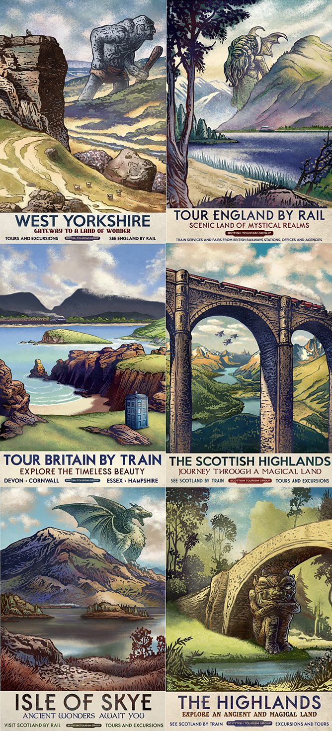 Travel poster series by Chet Phillips
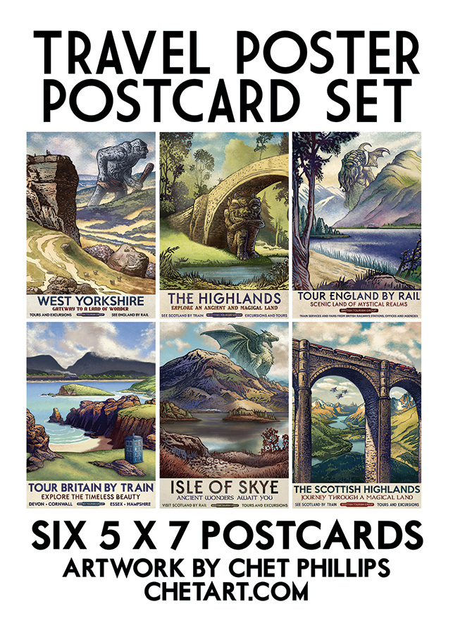
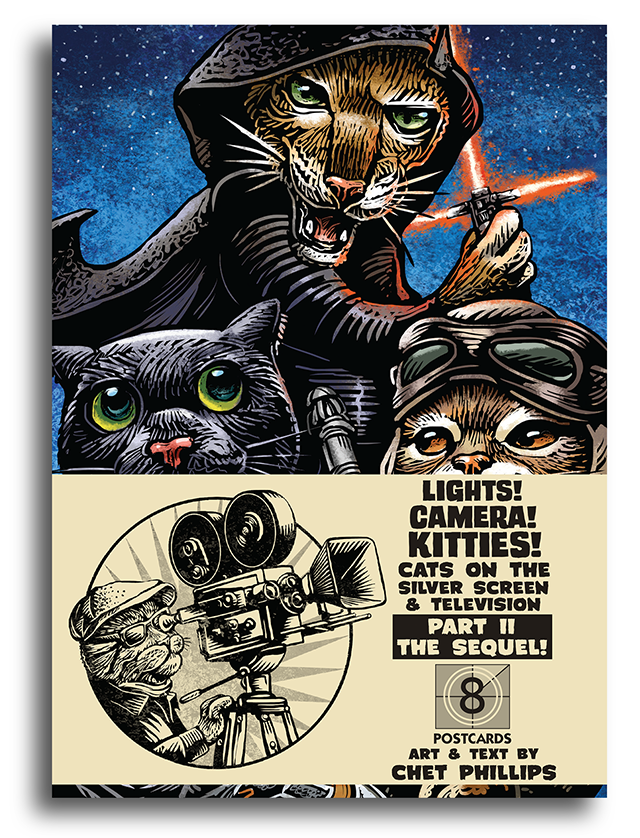
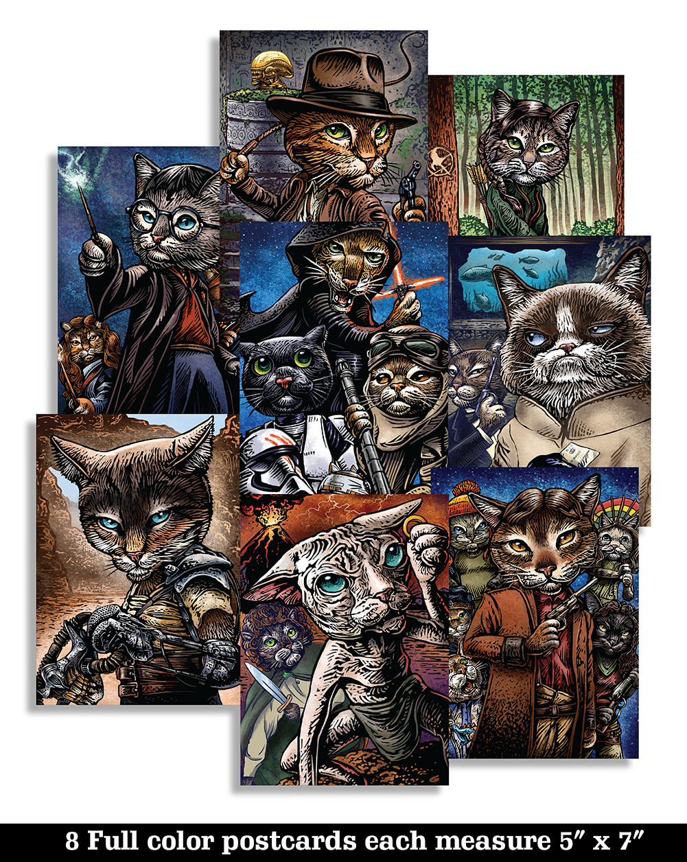
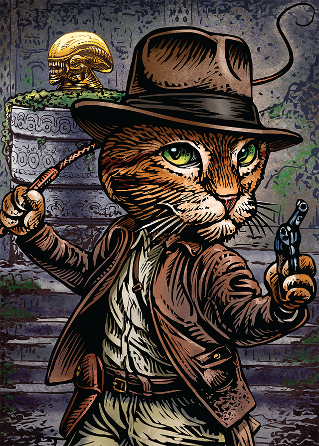
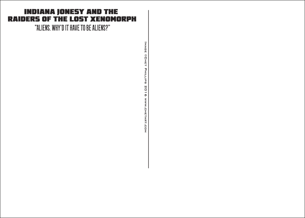
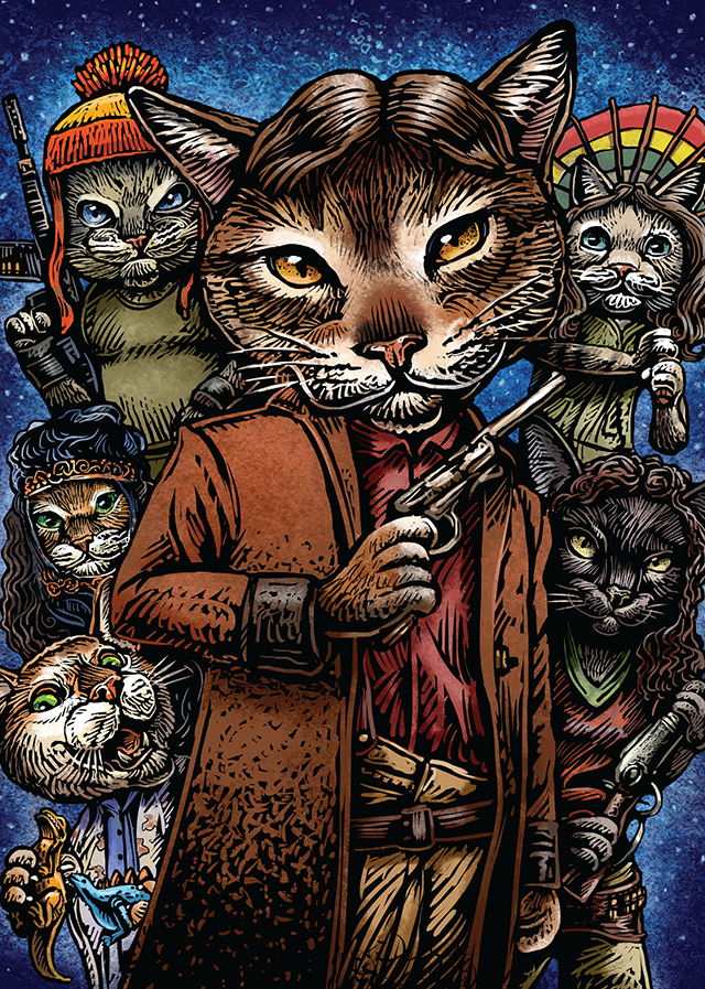
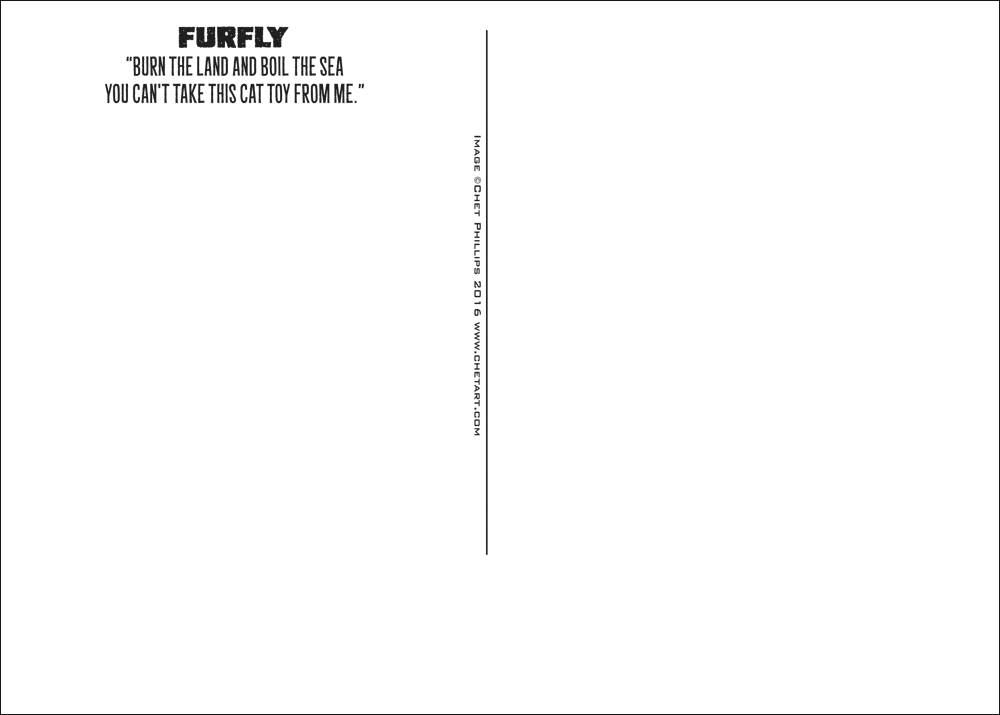
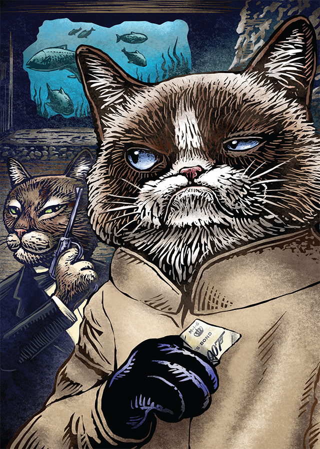
 Each 5″ x 7″ postcard is printed on sturdy 18 pt matte stock with postcard mailing design on the reverse of each.